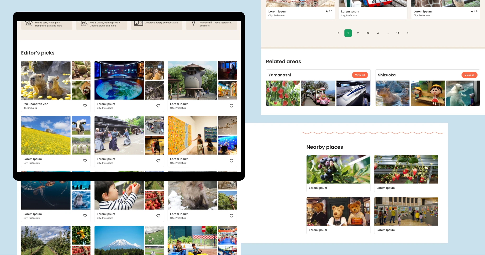
Playscape

Helps tourist and expat parents find kid-friendly places​

Featured Playscape

Playscape is an online resource for finding child’s friendly places & outdoor learning activities in Japan.

Playscape targets 1) expat parents who need an efficient way to find fun outdoor activities for their kids and also 2) foreign tourists who plan to visit Japan with their kids and need to find places for them to enjoy along the travel route.

Project duration

2 weeks / Feb 2023

My role

UX/UI, Brand concept, Illustration

This case study is part of my Google UX Design Professional Certificate.

Tablet Search results page

Problem

It could be stressful for parents when it comes to searching and making a decision for outdoor places and activity for their kids.

Goal

To design a one-stop website where parents come to find decent kid’s friendly places and plan for a family trip efficiently.

Playscape’s goal is to create an enjoyable experience for both parents and kids.

Understand the users​

I conducted interviews, which I then turned into empathy maps to understand the users I’m designing for and their needs. Our target users identified through research were expat parents who take their children to do outdoor activities on weekends at least twice a month and travelers planning a family trip with their kids.

Users felt that established travel guide websites could be overwhelming to navigate while travel blogs are full of sponsored posts. This caused a normally enjoyable experience to become challenging for them.

Empathy map

User pain points

1

Scattered information

Overwhelmed with the numerous but repetitive and irrelevant choices available on the internet.

2

Inorganic endorsements

Hard to find real personal insights, opinions, and inspiration from like-minded people.

3

Overrated and overcrowded

Bored with the same places constantly being promoted. The end result is overcrowded destinations.

Target audience – Alyssa

Alyssa is a professional working mom from Singapore who needs an efficient way to find family-friendly outdoor spaces and plan fun activities for her kids because she has limited time to spend on searching and planning.
Target audience

Goal

  • Support and take part in her children’s play activities that will keep them busy
  • Encourage their children to increase their time outside and away from their devices
  • Get a quick, up-to-date and reliable sources for planning her children’s activities

Frustrations

  • “I have very little time to spend on planning”
  • Mostly only established or large-scale places are featured online as they paid for advertising. They can be crowded on weekends.
  • The content was outdated. We were there to find out that the business permanently closed.

User journey map

I created a user journey map of Alyssa’s experience using the site to help identify possible pain points and improvement opportunities. 
User journey map

Starting the design

Our users’ primary purpose is to search. For example, local parents look for particular places in their area or city, and travelers look for particular places located along their travel route.

My design goals were to

  • help users get started and find a solution quickly.
  • gain users trust and make them feel supported. Each listed place is pre-screened and reviewed by the community.
  • create a sense of community.
Sitemap
Prototype

Refining the design​

Midway through this project, I created a detailed, high-fidelity prototype based on the mockups and conducted usability testing with five potential users to assess the current hypotheses and pinpoint any problems in the user flow.

The high-fidelity prototype enabled users to react more organically, resulting in insights on the brand’s image and its accessibility.

Study type:
Moderated usability study

Participants:
3 participants

Location:
Thailand

Length:
5-10 minutes

Insights

1

Categories

Users experienced difficulty selecting the category they were searching for, which caused confusion.

Proposed solution: Recategorize and add short description underneath

2

Optional login

Users perceived that being required to log in to utilize a wishlist feature is an obstacle.

Proposed solution: Use Cookies to store user’s wishlists until they expire or are manually cleared 
by users.

Results​

After several iterations and the insights from the usability study, here are the final mockups

Find and explore

Offers both keyword searching and Category browsing modes.

Find and Explore

Search results

Filter function allows users to limit the scope of search results to a more relevant selection.

Including an interactive map (Suggestion: Mapbox or Google Map) alongside a list view helps users quickly scan places that located in their preferred area and the distances between them without having to open another app.

Search results

Wishlists (Saved)

Allows users to collect and share the lists in a well-organized way.

Build up online community

One way to solve user pain points is to integrate genuine user insights/inspiration to the website.
To encourage community engagement, I designed sections for:

  • Parenthood stories
  • User reviews
  • “Refer a place” program

More discovery / Recommendations

Provides related information to encourage further discovery without interfering with their search and browse intentions.
More discovery

Screen size variations​

I made sure the website looks its best on mobile phones, tablets and desktop screens.

Responsive homepage

Accessibility considerations

Lazy loading images

As the website contains numerous images, incorporating lazy loading for images significantly reduces the amount of bandwidth utilized by users, particularly those who access the site on mobile devices or with a slow internet connection.
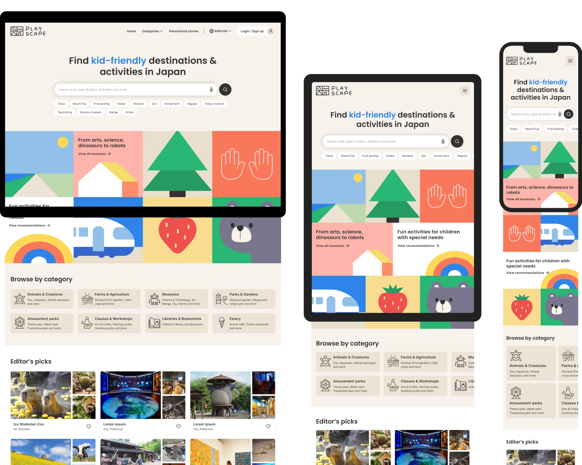
Heading hierarchies

To help users navigate with a screen reader, I used headings with different sized text for clear visual hierarchy; H1 for page title, H2 for title of grouped contents and H3 for title of smaller sections.

Some other considerations

Auto-suggest for search, Language selectors, Alt text for images and Keyboard functionality.

What I learned​

Crafting a compelling informational website can prove to be challenging because there is far more than just a well-designed search function. What I learned the most was to strategize how the website could be useful for the intended users while also ensuring that it could scale up effectively to accommodate a diverse array of content and continued expansion.