Deep Breath is a not-for-profit organization focusing on nature-based mental health promotion. The organization needs an online tool to build bridges between people and nature through audiovisuals (sounds, images, and captions) recorded in nature locations across Thailand.
Deep Breath aims to help users improve their mood, calm and reduce anxiety while doing everyday activities at the same time raising awareness on how nature is essential to their lives.
Project duration
8 weeks
My role
UX/UI, Brand concept, Illustration
This case study is part of my Google UX Design Professional Certificate.
Problem
Nature therapy has played an important role in health promotion. Unfortunately, some people may not reach out to get help due to inconvenience and busy lifestyle.
Goal
Design an online nature connectedness app offering curated selection of nature soundscape tracks and background that helps people relax and slow their mind in a fast-paced world.
* Deep Breath is not designed to be a meditation app.
Understand the users
I used data on mental health to develop interview questions, which were then used to conduct user interviews. Most interview participants reported poor sleep quality and racing thoughts. They were seeking help to recover from stressful situations and looking for nature’s atmosphere to rest, but couldn’t find time to go outside or to the countryside. They wanted to have access to an easy-to-use, preferable online tool that provides help for those struggling.
Our primary target users are adolescents, college students and young working professionals who need help to relieve stress while studying, working or on the go.
Aswin is a work-from-home energetic young man who needs to have continuous ambience sounds playing in the background because he wants to be relaxed and focus on working without being distracted.
I want to calm my busy lives and busy minds.
Kate is a college student living with ADHD who needs a way to feel more in touch with the natural world because she is experiencing difficulties in her daily life.
I have always had a deep love for nature. After moving away from my hometown I felt I had lost that opportunity.
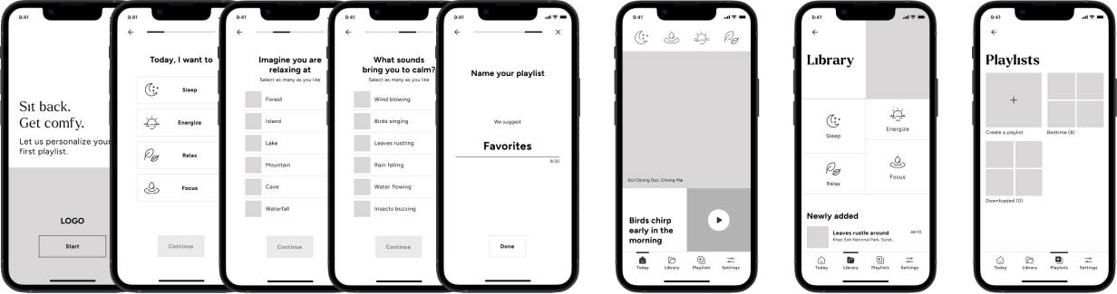
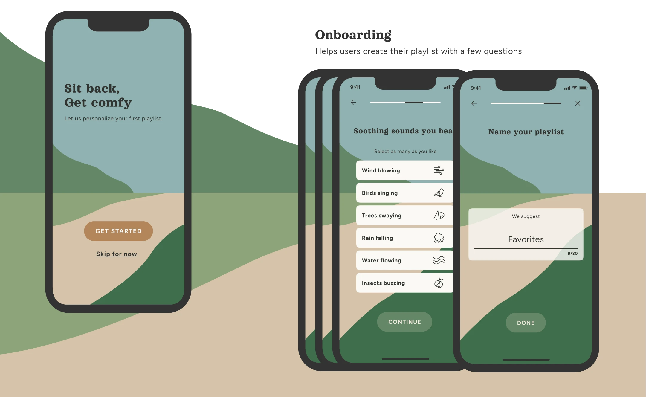
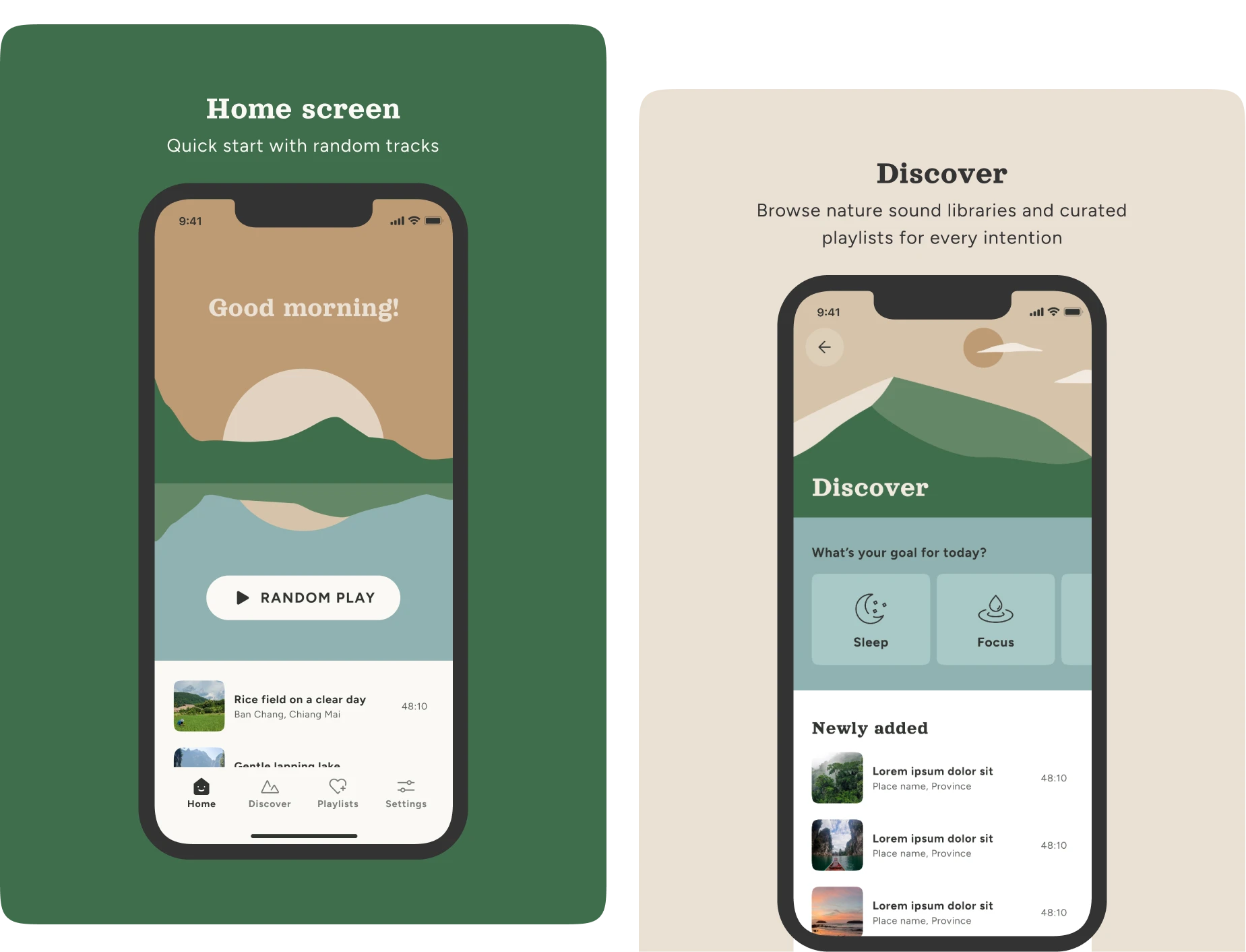
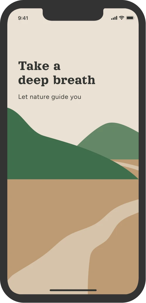
Initial design concept
After ideating and drafting some paper wireframes, I created the initial designs for the Deep Breath app. These designs focused on delivering effortless self-healing through nature sounds and visuals.
Usability studies
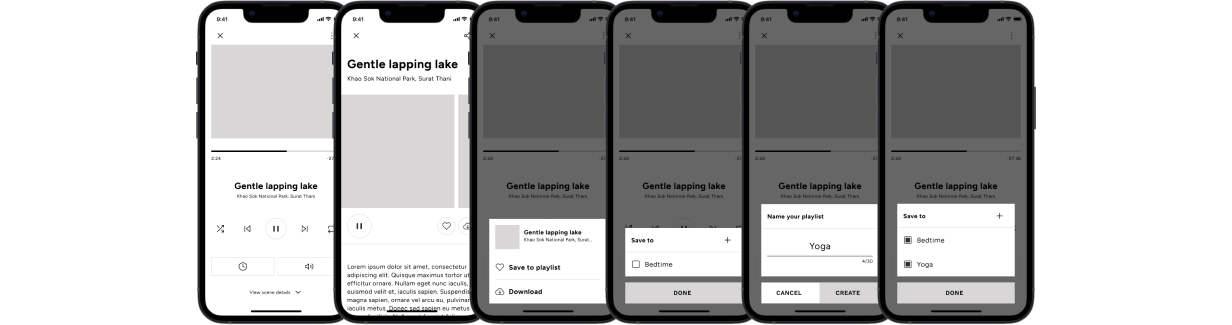
To prepare for usability testing, I created a hi-fidelity prototype that consisted of the user flow of creating a playlist, saving a track to playlist and the use of mini-player.
Study type: Moderated usability study
Participants: 5 participants
Location: Thailand
Length: 10-15 minutes
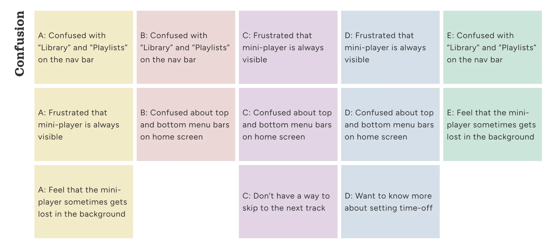
Affinity diagram
Insights
1
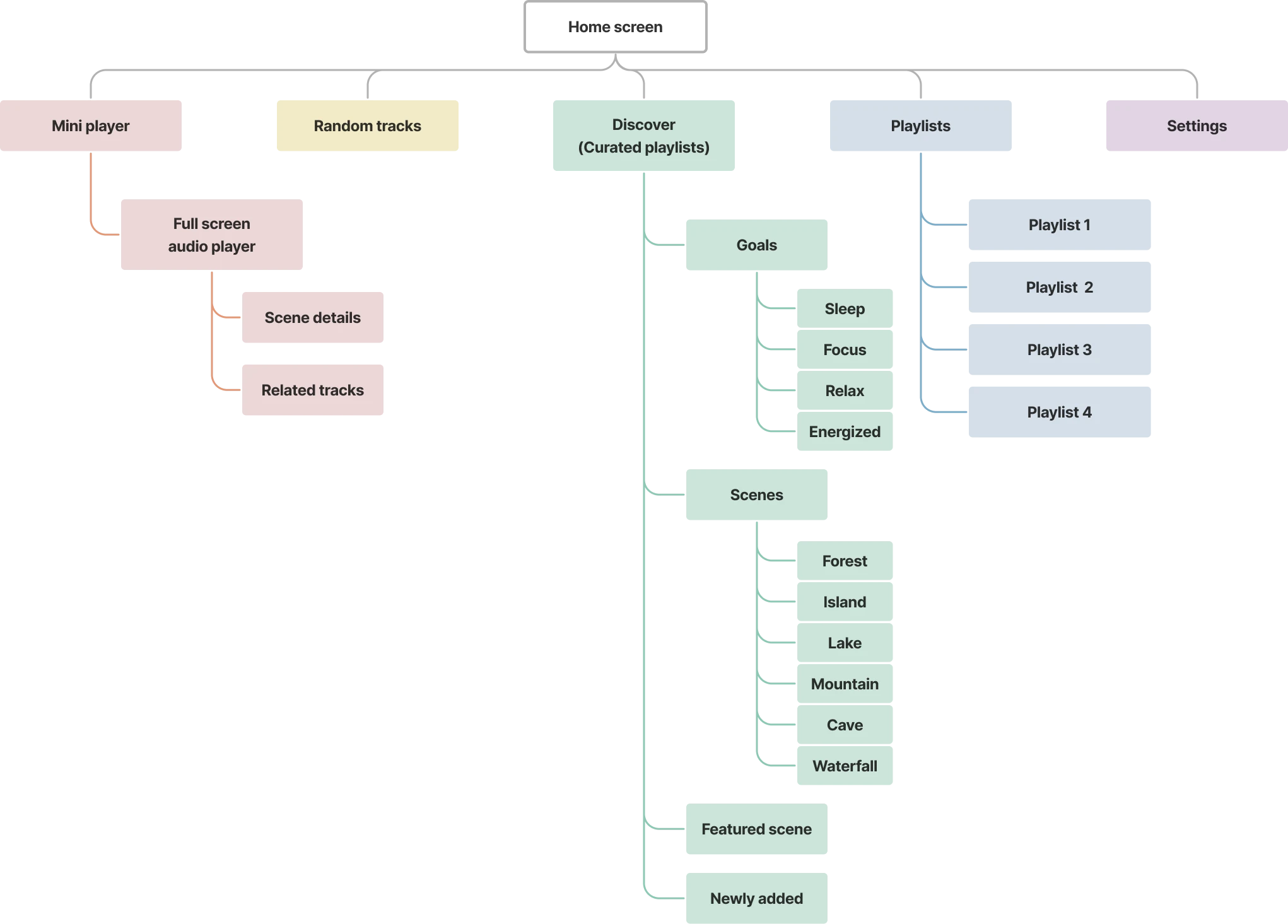
Home screen
Users are confused by having both top and bottom menus.
2
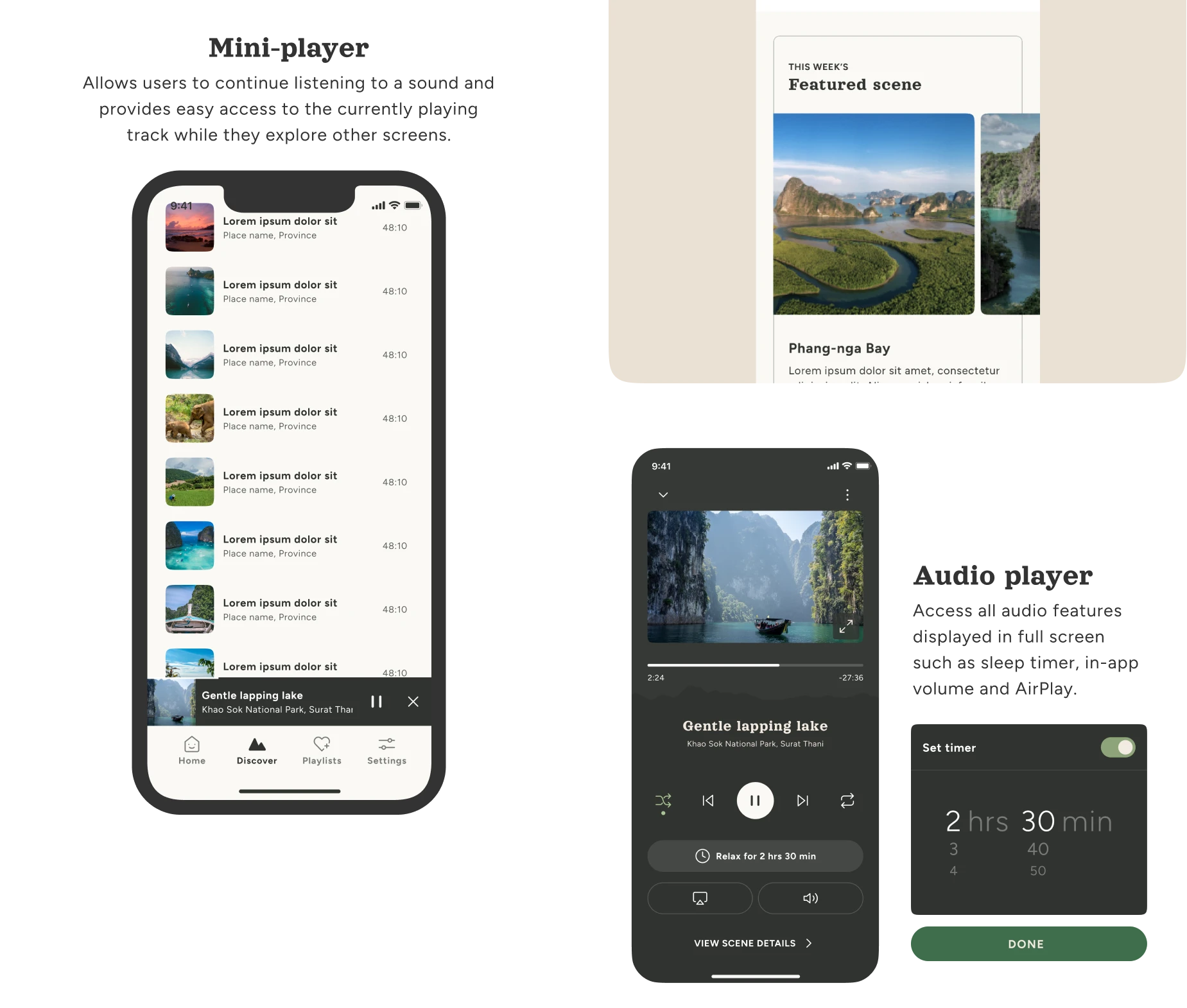
Audio mini-player
Users find frustrated with mini-player always staying when no track is being played
Users feel the mini-player sometimes gets lost in the background.
3
Navigation labels
Users are unable to immediately distinguish between “Library” and “Playlists” menu
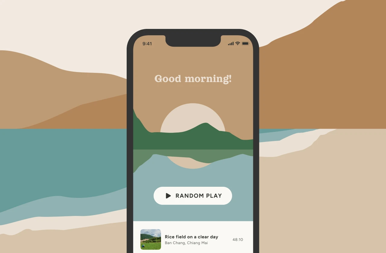
Results
After several iterations and the insights from the usability study, here are the final mockups
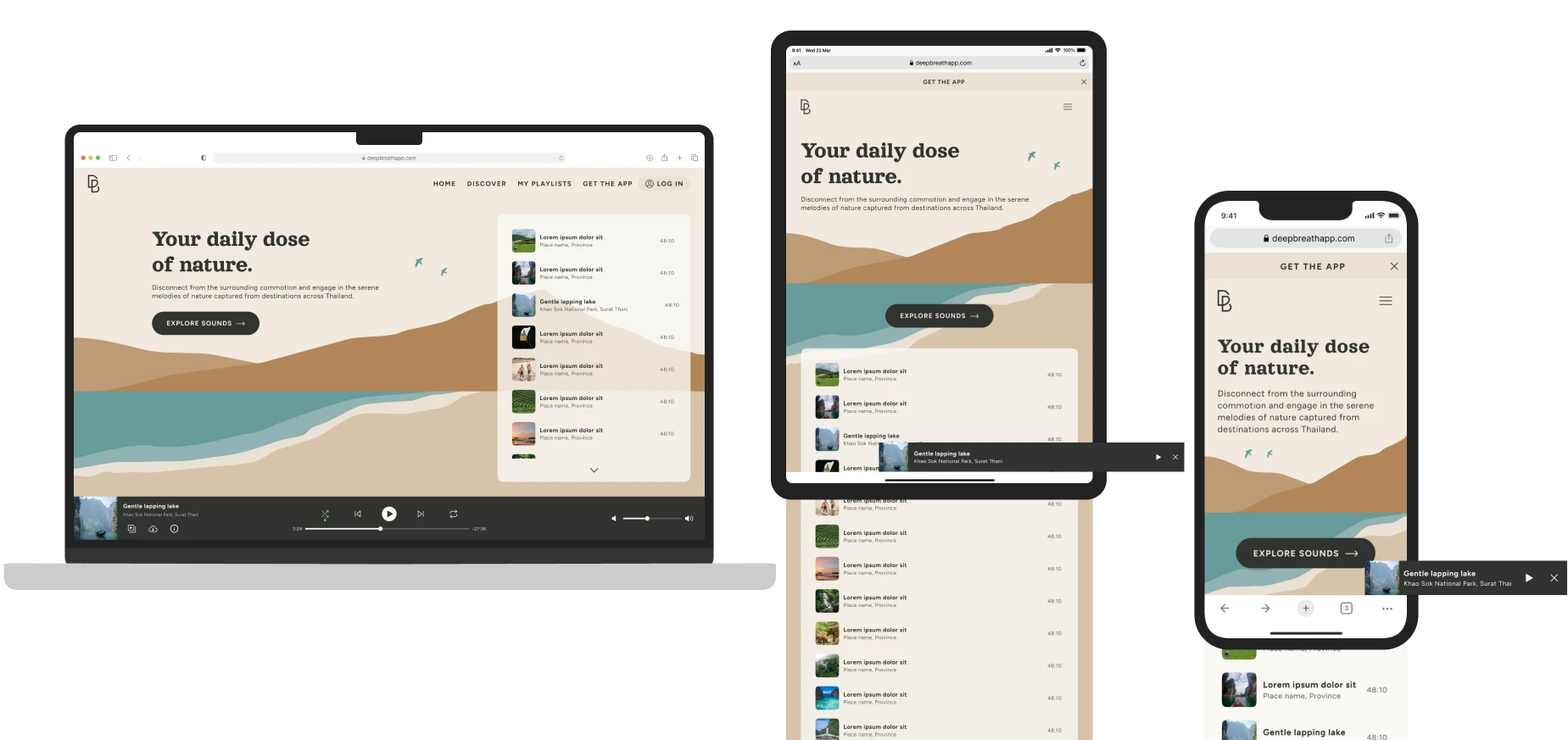
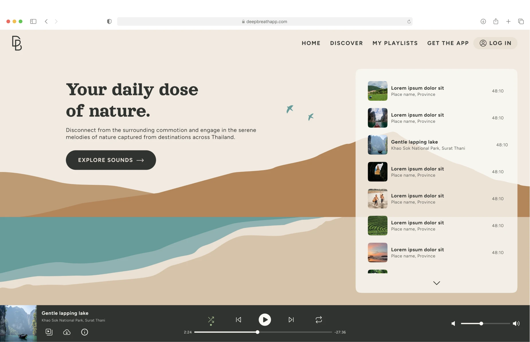
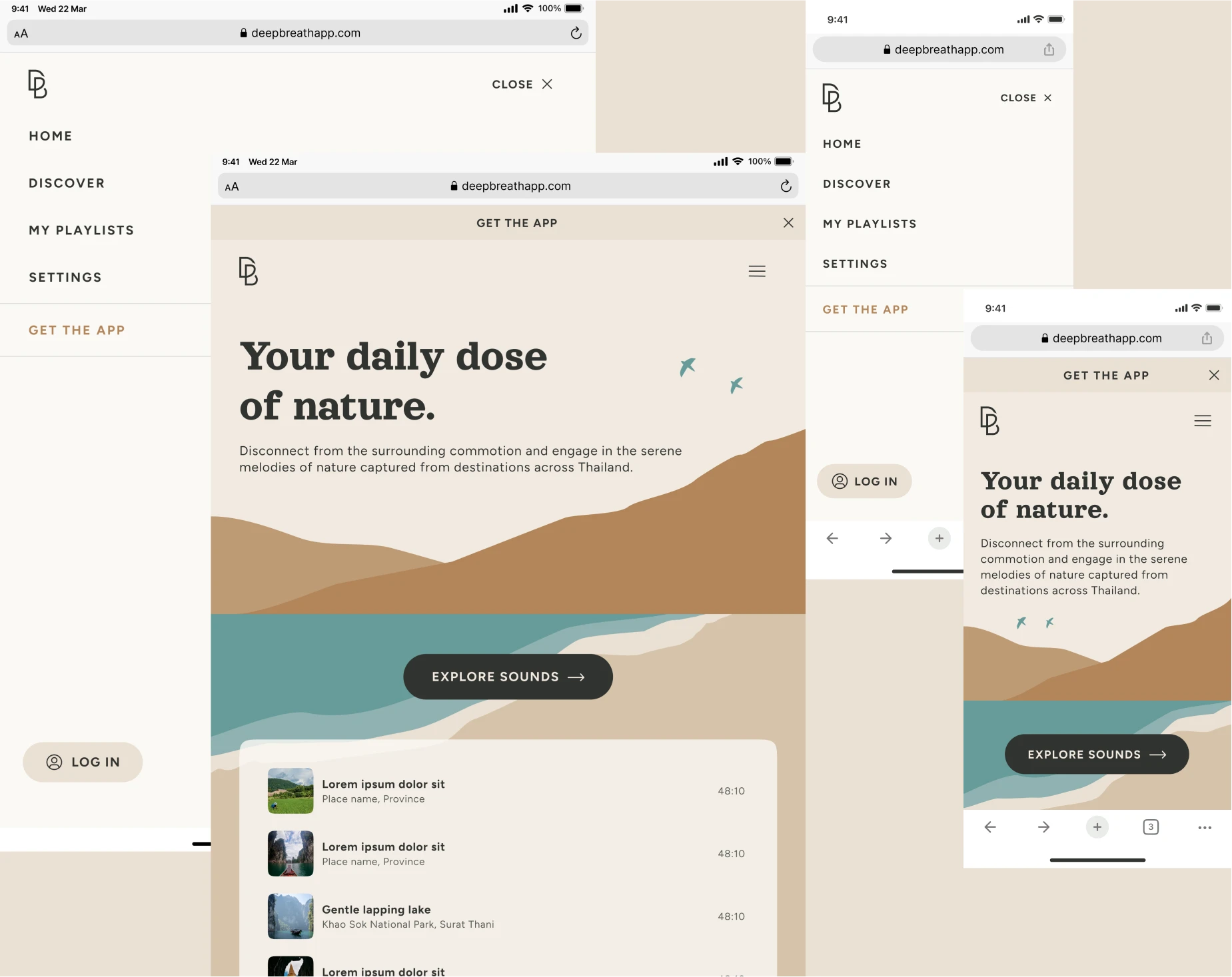
Complementary website
The responsive desktop website allows cross-device playlist synchronization (login required) to ensure a cohesive and consistent experience across devices, while also serving as a marketing tool to funnel the site’s traffic towards the mobile app, which offers a better user experience in terms of speed, ease of use, and enjoyment.
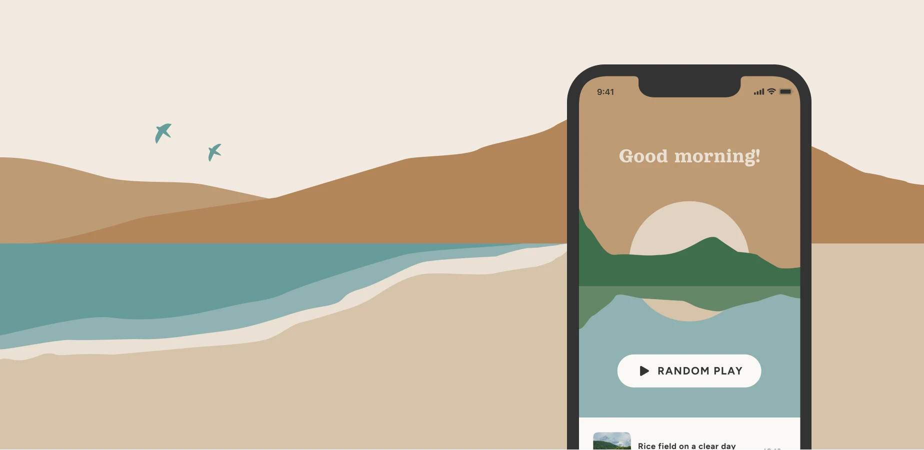
Visual concept
I designed this earthy color palette with pops of bold colors that is soft and balanced, while also retaining good contrast and visual interest.
This palette was used in illustrations, backgrounds, and typography, resulting in a relaxing yet entertaining interface.
Color palette
I designed this earthy color palette with pops of bold colors that is soft and balanced, while also retaining good contrast and visual interest.
This palette was used in illustrations, backgrounds, and typography, resulting in a relaxing yet entertaining interface.
Typography
I picked this bubbly and friendly typeface with slightly vintage vibe for the headings to draw immediate attention to the message we want to emphasize.
Foggy mountain after rain
Illustration
To enhance the visual appeal and ambiance of the app, I drew a collection of minimalist abstract illustrations. By incorporating muted earth tones, the overall effect is calming and enjoyable, which helps users feel more relaxed and engaged.
What I learned
This was a challenging but fun project to work on because I never used any music streaming services.
I encountered a bit of a learning curve but after extensive research and collaboration with users at every step of the design process, I was able to get the work done without major difficulties.